Wish List

Wednesday, March 29, 2017

Another twist and pop card...

I shared my first twist and pop card in this post a while ago. It was so much fun that I made another one for my son-in-law Rob's birthday. He especially appreciated the unique mechanism in this card and was really studying it, trying to figure out how I did it.

My "boogie boy" was cut with my Cricut from the Nifty Fifties cartridge. Isn't he fun? My sentiment stamp is one that I picked up at my local thrift store, so I have no idea who made it. I think it's one I'll use regularly, though. It works well for those oh-so-difficult man cards.


Here's a little closer look at the Cricut cut. It had been such a long time since I had used my Cricut that I nearly had to get out some directions to figure out how to do it! I think I need to use it little more often so I don't get so darn rusty.


Here's a look at the inside of my card with its pop-out panels. So fun! The happy birthday die-cut is one of the unbranded dies that are available on eBay.


It can take a little more time for this kind of card with the four panels to embellish. I really enjoy planning and decorating the smaller spaces, though.


These little panels offer a great opportunity to use some of those smaller stamps that we pick up in the dollar bins or that come as accessories in larger sets.


I have one more of these cards still "under construction" in my craft room. I haven't decided how I'm going to finish it, yet--I'm waiting for a bolt of inspiration to strike. I guess I really should just make a few of these without any embellishment and then finish them as I need them. That would probably be the smart thing to do, but I never claimed to be the brightest bulb on the tree. he he

Thanks so much for stopping by, and remember to laugh--a little or a lot--every day.
Cheryl

Monday, March 27, 2017

Explosion purse...

I wanted to make a fun little gift bag for my granddaughter, and found this video on YouTube for an explosion purse. It looked easy and fun and was just the size I needed.

I think I could've made my handle a little shorter, but it was still pretty cute IRL. To secure it, I punched a hole in the top on each side, slid the ribbon through and knotted it so it wouldn't pull through the hole.

I used some sticky Velcro circles as a closure. They worked beautifully, even when it was a bit overstuffed with little gifty items for my granddaughter. The strawberries on the circle die-cut were fussy-cut from the DSP.


A side view of the purse shows you the size. The base of the purse is 4" X 4", so it has room for a small gift or two inside.


Here's a look at the backside of my purse. The green top is a Spellbinders Label 8 die-cut. It was just the right size to cover my purse. I glued the back of it down and the front has the Velcro closure as I mentioned before.


When you open the purse, this is what it looks like. What I liked most about this idea, was there were very few pieces to contend with, very little glue/adhesive involved, and it used an entire sheet of 12" X 12" DSP plus a scrap for the top closure. Quick and fun to make!

This week I will be busy with a couple of my grandkids, as they are on spring break and need a little supervision. Maybe we'll even get a little crafting done.

Thanks so much for stopping by, and remember to laugh--a little or a lot--every day.
Cheryl

Friday, March 24, 2017

A Poppin' Box Card...

I found a little video on YouTube by Gemma Clarke that inspired me to make this card. Actually, I watched two of her videos as I needed to make both parts of this surprising card. Here is where the second video is located.

 Here is a picture of all the components of my Poppin' Box Card. I made a money holder to slip inside the rectangular box that will hold the cube, which flattens out to fit inside. As you can see, this was for a 21st birthday, so one side of my cube was embellished accordingly.

Here's a picture that shows how nicely the cube flattens out to fit inside. You can also see the little ribbon handle that I've added on the right. I used the blank circle as a space to write a brief note and sign our names. Here are the other two sides of the cube.


I think this is a Petaloo flower with a flat-backed pearl in the center. The leaves were made with a Martha Stewart punch, folded in half and run through my crimper. I also inked them a bit for a little more dimension.


The butterfly was cut with an Ellentina die after I had inked my white cardstock with some pink and green.

There is a rubber band mechanism inside the card that causes the cube to pop into the shape you see on the right from a flattened state. So fun!


Finally, here's a little video that shows you how this card works:

This is my first online video, so I wasn't sure at all if I'd be able to get it to work.

Thanks so much for stopping by, and remember to laugh--a little or a lot--every day.
Cheryl

Wednesday, March 22, 2017

Happy Bird Day...

Here's a fun and quick card using some Tim Holtz Crazy Bird stamps.

First I created my background, using several Distress inks. Then I stamped the birds on some white scraps, colored them with ProMarkers and cut them out with the coordinating dies.

My speech bubble was cut with a Darice die after I had printed the sentiment with my computer.

I inked around the edges of my bird shapes so that not too much of the white card showed through. I also added some Glossy Accents to their eyes. Each bird was popped up with foam tape (but their little feet were glued directly to the card so that they didn't get caught on something and rip.

It was fun to pick out different colors for each of them. Quite a motley crew, don't you think?

Pretty simple interior on this one: a computer-generated sentiment and another partial bird peeking up at it.

My daughter used this to give to a family member celebrating her birthday recently, so it went to good use.

My DH and I managed to contract some wicked colds, so we're both at home today and not feeling well. But at least I feel well enough to do a blog post. LOL

Thanks so much for stopping by, and remember to laugh--a little or a lot--every day.
Cheryl

Friday, March 17, 2017

My personalized travel mug...

As spring approaches, thoughts of summer RV trips are constantly on my mind. I can hardly wait! In preparation for hitting the road, I decided I needed a personalized coffee mug. I NEED my coffee every morning, or a headache ensues. Addicted to caffeine? Yup. I'd be the first to admit it.

A while ago, I visited a fun blog called Watcha Workin' On? While browsing around, I found a Silhouette file and detailed instructions on how to create my own personalized Starbuck's-style cup. I decided to give it a go, and here's how it turned out.

 
I didn't have any dark green vinyl, so I just used the teal vinyl that I had on hand. I figured that would be okay since it's just a look-alike logo, anyway.


Here's a little closer look. I discovered after I took this picture that there was a teeny tiny piece of black vinyl sitting in the corner of the mermaids left eye (the right one as you look at her). That's why that eye looks a teensy bit different. Once I picked off that tiny piece of vinyl, it looks perfect.

I actually couldn't believe how quickly this came together. The hardest part was adding my name and getting the letters spaced somewhat evenly. Cutting the two different layer colors and then adhering them both at one time was a snap. I learned how to do that from the Silhouette School blog.

It actually looks pretty cool, and everyone who has seen it has been pretty impressed.

The logo could have been a little smaller for this cup, but I was concerned about the intricate cuts of the mermaid. I thought it might not work as well if they were even finer. Next time, though, I'll try cutting a smaller one.

I hope you're all having a fantastic weekend. A belated happy St. Patrick's Day to all of you. I got to take two of my grandchildren (3rd and 5th grade) to school this morning. Before we left, I had to spray their hair green! We used the colored hairspray that kids use at Halloween. They were both all dressed in green and very excited to get to school. They looked like a couple of leprechauns and were very proud to say they're half Irish (because their dad is 100% of Irish descent).

Thanks so much for stopping by, and remember to laugh--a little or a lot--every day.
Cheryl

Wednesday, March 15, 2017

Floral Easter cards...

I've been busy lately creating some Easter cards. It will be here before we know it, and I'm hoping to get my cards all finished this week, so I can move on to other Easter preparations.

I pulled out a couple of older Spellbinders dies called "Asters and Poppies." Both of the dies used on these cards were one layer dies that could be embossed, but I cut them twice--on green and pale pink CS--and then made my own layers. I also dry-embossed and then inked them while they were still in the dies to add a little more dimension. The folding banner die is from La La Land, and the sentiment was computer generated.


I think this die-cut looks very delicate and pretty. Just right for Easter, even if it is a poppy and not a tulip.

I dry-embossed my white strip of CS so that it didn't look quite so plain.


Here's the aster flower. These two come together as a set, which is nice. I think this flower could pass for a Sweet William (Dianthus) flower, which definitely blooms in the spring where I live. I almost always have them in my flower beds, and I love their bright pinks and purples and prolific blooms.


This flower was dry-embossed after die-cutting, and once again, I inked it while it was still in the die. I also inked the tips of my petals before adhering it all to my card.


The inside of my card is pretty simple. I just followed the layout on the front of the card and added a stamped sentiment.

I think I have made about 20 Easter cards now. I'll be sharing more of them with you in the coming days.

Thanks so much for stopping by, and remember to laugh--a little or a lot--every day.
Cheryl

Thursday, March 9, 2017

Another "mainly teal" card...

http://simplylessismoore.blogspot.pt/


Just a quick post today with a simple card. I decided to try foiling some Easter eggs (clipart found online) on my card with teal foil--another entry for challenge #318 Mainly Teal over at Less is More.


I first printed the images with my laser printer, then covered them with Deco Foil, placed them in a carrier sheet and ran them through my laminator three times. I was so pleased with the end result.  The foil was smooth and solid and the coverage was excellent!

The sentiment was printed at the same time as the egg images, but I chose not to foil that.

To finish my card front, I added a few silver sequins and a little twine bow (now I'm thinking that bow was totally unnecessary, so next time--no bow!).


A stamped sentiment and flourish finished off the inside of my card. This was the quickest Easter card I have made to date, so I think I'll make a few more.

Thanks so much for stopping by, and remember to laugh--a little or a lot--every day.
Cheryl

Wednesday, March 8, 2017

A "mainly teal" card...

There's a great challenge over on the "Less is More" challenge blog for "mainly teal" projects.  Well, I happen to have a mainly teal Valentine that I haven't had time to post yet, so I'm doing so now and entering it into the Less is More challenge.

I used a heart-patterned CS from my stash, finishing the bottom edge with a Spellbinder's curved border die. I backed my CS with a layer of black, then added a black strip and a stack of heart shapes on the front. I think you can see the glittery sparkle on the smallest heart.

The stamp for the "Love" sentiment came from a Recollections Valentine set of stamps and small cards. It's made with such a pretty font. A few teal-colored sequins finished off my card front.

The inside of my card is pretty simple with just a black mat and a pretty stamped Valentine's greeting by PSX.

I think this card could easily work for a wedding or anniversary card, too, don't you?

I spent Tuesday with my sister having fun with some of her dies - cutting them out on my Cuttlebug. We can't often get together because she lives so far away, but when we do, we like to share craft supplies, techniques and ideas,  and encourage each other in our card making.

She brought me a brand new die to add to my collection, and I gave her a sanding eraser. I have found this eraser to be a life saver because it can erase ink smudges on many solid core cardstocks!

Of course, we did a little crafty shopping, too.

Tomorrow I'll be volunteering all day at a local thrift shop. I wonder if they will have gotten any new crafting supplies in...

Thanks so much for stopping by, and remember to laugh--a little or a lot--every day.

Cheryl

Monday, March 6, 2017

Twist and pop card...

This card was surprisingly easy to make, yet it looks really complicated. And I love the looks on people's faces when they open it up.

If you'd like to give one of these cards a try, you'll find a great tutorial on Splitcoaststampers here. There are also lots of other video tutorials on YouTube. Just search for Twist and Pop Card.

Now I should have straightened out that bow before I took this photo, but, oh well. That's the way the cookie crumbles. I had punched two tiny holes in my CS to string my twine through, so it actually is not glued down at all. That's why it's kind of "free ranging" all over the place. he he

When you open the card--Shazzam!--this is what you get. Isn't that awesome?

Of course, this does mean that there's a lot more inside decorating going on. You've got to think about what to put on the four little panels that "pop out."


It is a great way to use some of those smaller stamps that never get used, though. I had fun going through my stamps and picking out some smaller ones that would work. I ended up choosing from several different sets, mixing and matching them until I had something that worked.


On the inside top of my card, I added a die-cut. It's one of those cheapy ones that came from China. I think it cost about $1.50. It was the perfect size for this space.


Here's one last look at my card. I had so much fun making it, that I made another one right away. I'll share that one with you in another post.

We had a warm springlike day today, but with lots of wind. Tomorrow, temperatures are going to start sliding backward again. They say we could even have some snow by week's end. Sheesh! I never know from day to day if I should wear my wool coat or a rain coat or just head out with no coat at all.

Thanks so much for stopping by, and remember to laugh--a little or a lot--every day.
Cheryl

Sunday, March 5, 2017

Let's Craft and Create Challenge #123: Entwined (Use twine)...

We've got a fun new challenge for you over on Let's Craft and Create. We're calling it "EnTWINED" and asking you to use some twine on your creation.

I wanted to do a little more with twine than tie some around my card front and add a bow, but I really had a hard time coming up with something! Finally, I decided to use some twine for the stems of three shamrocks. I used natural twine because of its "woodsy" appearance.


To create my shamrocks, I punched out some small hearts with a Fiskars punch. I inked the edges, glued them to my cardstock and added a green brad for the center.

Oh, yes, I forgot to mention that I decided on the placement of my shamrocks first and glued my twine stems down before I added any of the heart shapes.

I made one four-leafer for good luck. You can see that I also added a nice coating of Wink of Stella to that one.

The legend of the shamrock (with three leaves) says that St. Patrick used it to explain the doctrine of the trinity.

As you can see, I still wound my twine around my CS a couple of times and tied a bow. My sentiment is from a thrift store stamp set. The stamped oval is popped up with foam tape.

My inside sentiment was computer-generated. I had a little trouble getting it to print clearly because I was using some pretty heavy cardstock that my printer did not like!  I added a little stamped shamrock (colored in with a Letraset Aqua Marker). This stamp came from the same thrift store stamp set (company unknown) as the sentiment.

Now it's your turn. You know you've got all that pretty twine sitting there begging to be used. We're giving you the perfect reason to put it to good use. Now go. Let your mojo take over, and don't forget to link your creation here.

Thanks so much for stopping by, and don't forget to laugh--a little or a lot--every day.
Cheryl

Wednesday, March 1, 2017

We think you're spectacular...

I made a card recently for my son's birthday. He's in his (gulp) 40s. I don't even want to think about how old that makes me!

It's sort of a whimsical (that sounds better than "silly," right?) card, and I hope it brought a smile to his face.

I cut both the glasses and the bow tie with my Silhouette by tracing clipart images I found online.


Here's a closer look at those glasses. You can see that I added a couple of tiny "screws" in each corner with a silver Viva Décor pen.

I happen to have some big green googly eyes in my stash. I thought they went nicely with the plaid DSP.

The eyebrows and smile were clearly hand drawn. :)


My sentiment was computer-generated, and I inked around the edges of the bow tie and added a little shading near the knot with a ProMarker.


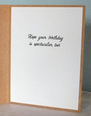
The inside of this card is pretty plain because I knew I wanted to write a little longer personal note.

We don't give our grown children birthday gifts per se any longer. I make a card for each one, and then we make a donation to a charity we think they'd like to support.

If you have grown children, what do you do for their birthdays?

Thanks so much for stopping by, and remember to laugh--a little or a lot--every day.
Cheryl