Wish List

Friday, January 30, 2015

Happy birthday to a beautiful 7-year-old!

My granddaughter who lives in Portland, OR, is turning seven today, and here is the card I made for her.

Step cards are so much fun, and this one was no exception.  The focal image was created by Anna Stillwell of Cuddlebug Cuties. If you've never visited her blog, I recommend a little look-see at all her fabulous images, which she generously shares with her readers.


I colored the image with my ProMarkers except for her skirt, which I paper-pieced. I also added some Glossy Accents to her balloons.

After fussy cutting around the red balloon, I used a Lifestyle Crafts scalloped oval die to cut her out.

I'm not sure who made the circle happy birthday stamp, but it was stamped with Versamark and heat embossed.


The buttons have also been die-cut with my Impression Obsession button dies. When I have time, I make them out of scraps of paper that are too small for anything else. I keep them sorted by color, so that I can easily find just the one I want.


The hanging hearts on each side of the card were cut with the Memory Box "Precious Hearts" die. After I took them out of the die, I used a stylus to round the heart out a bit and added a gem to the bow.


The inside of the card has a computer-generated sentiment and a couple more buttons for good measure.

I sure hope my granddaughter likes her card! This card took a while to make with all its little details, but I had a blast doing it.

Thanks so much for stopping by, and remember to laugh--a little or a lot--every day.
Cheryl

Wednesday, January 28, 2015

Cards with a simple, springlike design...

I must be getting tired of winter and wishing for spring in a big way. When I decided to make a cards recently, I immediately thought "flowers!"
I love this Lifestyle Crafts embossing folder. I think it's perfect for cards like this, and the elegant pattern embosses beautifully. Since it is a very symmetrical design, it is also easy to emboss the top of the cardstock piece, then turn it around and emboss the bottom part, leaving space for a sentiment.

I have a little box of Recollection white and off-white flowers, so I grabbed one of those and a couple of my ProMarkers and went to work to put some life into the flower. I used two shades of blue, and believe me when I say this flower is even more vivid IRL.


The flower center is a cluster of microbeads. I squeezed on some Glossy Accents and then sprinkled micro beads on top of that. When it was dry, I shook off the loose beads, and voila! - a perfect flower center. My daughter gave me a set of 6 colors of microbeads for Christmas, and I am loving them!

The leafy branch behind the flower was cut with a Memory Box die called "Fresh Foliage." After die-cutting, I cut the fronds apart and adhered the pieces under my flower so that they fell the way I wanted.

I was so pleased with how this card turned out, that I decided to try coloring a few more flowers and creating a set of four cards.


I had so much fun coloring the flowers and seeing how they looked on each card.

I stamped a sentiment on only two of them and left the other two blank. It will be easy enough to stamp something appropriate when the need arises. I've also left the insides blank for writing a personal note or for stamping a sentiment later on.

Thanks so much for stopping by, and remember to laugh--a little or a lot--every day.
Cheryl


Monday, January 26, 2015

Valentine's Day is just around the corner...

Can you believe that we are just a couple weeks away from the day of hearts and flowers, chocolates and cards, and best of all, hugs and kisses?

I have been busy making some Valentine cards along with all the other cards I've been working on. It seems like I'm making more cards than ever before. How is that possible? I haven't gained any new relatives or new friends to whom I am sending cards. Maybe I'm just slower in getting them made, and it only SEEMS like there are more of them.

Anyway, here's a Valentine card that I made recently. This one is decidedly more feminine than the last one.

This Valentine card was made using the traditional colors of red, pink and white. The background DSP is actually a deep pink and red pattern. I had fun adding a few sequins on this one.

I heat embossed the sentiment with white embossing powder, but it doesn't look very white, does it? That's because it really is an off white. Does anyone know of an embossing powder that is a bright white after heating it? I'd sure love to have some advice on this, so that I don't have to try 8 or 10 of them before I finally hit on a truly white one. I've got two containers of "white" embossing powder now, and neither one is truly white.


I cut this pretty heart from the Best Images of 2008 cartridge. It has four layers, but was very quick to put together. The top red layer with all the flourishes was sprayed with some adhesive and then coated with some clear glitter.

You can just see that I've inked around the pink scalloped heart with a darker pink ink.


The inside is pretty simple - just a computer-generated sentiment and some red hearts punched from the same DSP that was used on the front of my card.

Thanks so much for stopping by, and remember to laugh--a little or a lot--every day.
Cheryl


Friday, January 23, 2015

A Valentine card for my husband...

He is a dear man, but he doesn't read my blog...go figure...so I'm safe in posting his Valentine here before Valentine's Day.


I used a Lifestyle Crafts die called "Branches" for my branch, then added a couple of hanging hearts cut with the "Precious Hearts" die by Memory Box. The "I Love You" stamp is from a very old set - not even sure what brand it is anymore.

Here's the inside of my card with it's punch line:
My husband knows I like a good nap - especially on the weekends - so I think he'll appreciate this sentiment. LOL

Now, I just want to share what's been blooming at our house:

Isn't this a beautiful amaryllis? I love the contrast of the big, red blooms against the snowy looking weather outside.

This was a bulb that I picked up at The Home Depot in December. As we speak, all eight blossoms (four on each stalk) have opened up and it really looks impressive.

I've been reading online about the process in prepping the bulb for next year after the flowers have faded. Have you ever done this? I'm just wondering if it is ever successful. I'm not sure if I'll give it a try. Maybe...


Thanks so much for stopping by and allowing me to share a card and my lovely amaryllis.

Don't forget to laugh--a little or a lot--every day.
Cheryl

Tuesday, January 20, 2015

Some coloring practice on a baby card...

I love my ProMarkers and am trying to learn how to use them on my own. I think it would be great to take a class, but I've never seen any offered in my area. I know there are online classes available, but I think I would learn more if I attended one in person.

I recently made a card using a digital stamp from www.bodilsscrapperverden.blogspot.co.uk, and I colored the image with my ProMarkers. I have a hard time maintaining a smooth appearance on my images. I'm not sure if that is just my inability to color well, a problem caused by not using paper specifically made for alcohol markers or both! I still have a lot of fun coloring, though, and I'm hoping my skills will improve with time.

I added some "dots" over the bear's fur with one of my brown markers, trying to make it look like it had some texture. Not sure I achieved that, but I think he's still pretty cute. I chalked the background of my image with a pale yellow, as I didn't like the stark white of the paper. One of the great attributes of alcohol markers is that they can be used in conjunction with other coloring tools (like chalk or watercolor pencils) to achieve lots of different results. I enjoy learning how to use these different kinds of tools together.

My background DSP is from My Mind's Eye "Boy Crazy" 6" X 6" pad. The sentiment was also on a page in this pad with several other sentiments , so I simply fussy cut it out and adhered it o the front of my card with some foam tape. The stars were cut with some Sizzix dies and covered with glitter before I added them to my card.


I also cut a couple of stars for the inside of my card.
The sentiment is a stamp from My Craft Spot. I FINALLY now have a set of "Welcome Baby" type sentiment stamps.

I'm entering this card in Passion for ProMarker's Challenge #280: New Beginnings.

Thanks so much for stopping by, and remember to laugh--a little or a lot--every day.
Cheryl

Sunday, January 18, 2015

Another masculine card...

My sister gave me some typewriter die-cuts a while ago. The die she used is made by Spellbinders, and it's such a great old-fashioned looking typewriter - not far off from the first typewriter I ever had. When I was a teen, I had to take typing in school (as most of us did back then), and I purchased a used typewriter from someone (I can't even remember who anymore). I used this old typewriter at home, and I think I may have even taken it to college with me. It honestly looked a little like this one! I'm telling you, it was OLD, which is the only reason I could afford it back then!

I added the little sheet of  paper after I printed "Thank you..." on it. I also added the semi-circle of gray cardstock, on which I had drawn some radii and inked its edges. A couple of silver mini-brads on either side and a gray piece of cardstock behind the keys.

The top and bottom borders on my card front were cut with a Cuttlebug die. Aren't they perfect for this typewriter card? That semi-circle in the middle of the border mimics the one on the typewriter!


You'll also see in this close-up that I added a couple of black faux-pearls to either side of the carriage with my black Viva Décor pen. There were a couple of tiny holes in these two spots and where the silver brads were attached. I could have done them all the same, but decided I liked adding both kinds of embellishment.


I also tried this card in a little plainer version with just a couple strips of black Washi tape at the bottom. I have to say, this one is fine, but I definitely like the first one better. How about you?

We've had kind of a lazy weekend. Napping when we can and definitely not working too hard. It was so nice not to have any deadlines to meet or functions to attend. I hope your weekend was lovely, too.

Thanks so much for stopping by, and remember to laugh--a little or a lot--every day.
Cheryl

Friday, January 16, 2015

Masculine cards...

Happy Friday, everyone! I hope your weekend is fabulous!

Recently, I was creating a selection of cards for my daughter to have on hand, and I wanted to include a few masculine cards. First, I wanted to try some stenciling, since said daughter had given me a selection of stencils for Christmas. I purchased some finger daubers for this purpose, and I have to say I LOVE both the stencils and the daubers.

I decided to tray this arrow-like pattern on my card front with some deep teal ink. Then I added a couple pieces of coordinating Washi tape and a sentiment that was cut out with an old Cuttlebug die.


On the inside, I added a little more of the stenciling, a strip of my cardstock and a computer-generated sentiment.

This was a super-quick card to make, and I know I'll be doing more stenciling in the future. It's definitely a fun technique!


For my next card, I selected some masculine patterned paper.
 My daughter had also given me a package of these cute little white banners that already had an eyelet in one end. They are the perfect size for some of my smaller sentiments, and I liked this design where I used one word per banner--no struggle to make sure the words are all perfectly aligned!

If you look closely, you'll see that a little piece of black ribbon is threaded through each eyelet hole, and then those ribbon ends are tied together with some heavy yellow thread (I think it's the kind that's normally used for crewel-type embroidery). I also wrapped this thread around my DSP three times before adhering it to my card front.


The inside of this card is very simple - just a yellow mat and a stamped sentiment from Fiskars.

I like using strong colors and graphic patterns for masculine cards. How about you? Do you have any go-to design methods for masculine cards? I'd love to have a few more ideas to lean on when designing these kinds of cards.

Thank so much for stopping by, and remember to laugh--a little of a lot--every day.
Cheryl

Tuesday, January 13, 2015

Thinking of you...

I was making an assortment of cards for one of my daughters, and I came up with this one.  The DSP in the background has a subtle leaf pattern on it in gray tones

The leafy branch is a Marianne Creatables die-cut. I'm not sure which stamp I used for the sentiment, but I love the font on this one.

On the inside of the card, I used one of my oldest stamp sets (not even sure of the brand anymore), to stamp another leafy branch, leaving plenty of room to write a note.

I used Versafine onyx black ink for both the sentiment on the front and the image on the inside. I find it to stamp cleanest and with the best coverage, especially for sentiments. Wish I had all the colors that are currently available. Sadly, I only have the black ink pad right now, but I LOVE it!


Well, that's it for me today. I now NEED to get started on my Valentines. I've challenged my sister to see who can get the first two Valentines completed first. We both feel we need a kick in the behind to get them done, so maybe this challenge will get us going.

Thanks so much for stopping by, and remember to laugh--a little or a lot--every day.
Cheryl

Saturday, January 10, 2015

Baby girl card...

My niece gave birth to a baby girl on New Year's Day, and I needed to make a card to send to her. I found some inspiration on Pinterest and came up with this sweet baby bib card.

First, I embossed the white background mat with my Cuttlebug Swiss Dots folder. Then, I cut a circle with one of my Lifestyle Crafts/Quickutz nesting doily dies. Using a smaller plain circle die, I cut out the neckline. I also cut a plain white circle to fit inside the doily die-cut and embossed this with a Darice embossing folder called "Floral Border."

A little bit of pink rickrack finished the neckline edge with three punched hearts at the center.

I tied a bow in the center of a length of stitched ribbon and then tucked each long end behind the bib to form the bib's tie.

Oh, yes, the three pink buttons were also made out of cardstock with my Impression Obsession button dies. Love those dies and the buttons they make. I generally use double-sided adhesive to adhere two pieces of cardstock together and then use that to cut out my buttons. I glue two of these together to total four layers that make a nice sturdy button, but not one that is so thick that it will require extra postage when the card is mailed. Notice that I have added some baker's twine to the buttons to make them look sewn on. I have a thing about naked buttons - in my book they just need some sort of thread when added to a card!


The sentiment on the inside was computer generated and three more little punched hearts were added as accents.


It was so much fun to make this girly baby card. I hope my niece likes it.

Thanks so much for stopping by, and remember to laugh--a little or a lot--every day.
Cheryl

Wednesday, January 7, 2015

Have you heard of the NBUS Challenge?


I hadn't heard of it until I became a happy follower of Darnell Knauss' super fun blog at www.djkardkreations.com. She is hosting her third NBUS (never-before-used-schtuff) on her blog here.

I decided to take up this challenge and use some things I've had for WAY TOO LONG and never used.

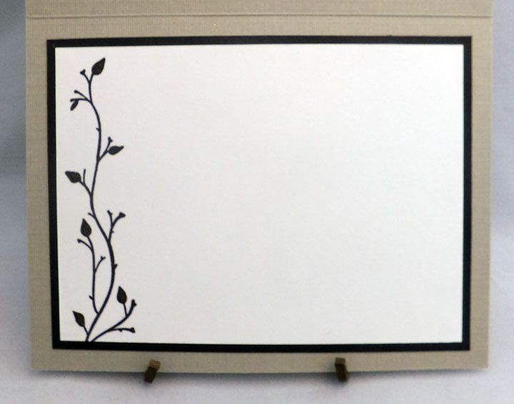
This is one of several embossed card blanks that my older sister gave me. Two or three years ago, she decided she really wouldn't be making cards much anymore--other than by printing them off from some of the online card creator programs. She divided her card-making goodies between my younger sister and me. We both really enjoy making cards and were VERY happy to take her "schtuff" off her hands.

Well, these blanks have been sitting in my supplies since I received them. Every once in a while, I would take them out and look at them and think, "How can I turn this into a card that's more...me?"

Finally (after learning about Darnell's NBUS Challenge), I had an idea and created this:
How did I do it, you ask?  Well, I took out my chalks, grabbed a few cotton swabs and started chalking up all the different flowers and leaves around the frame. When some of the chalk went outside the embossed image, I simply erased it! After I had all the flowers chalked to my liking, I added a little more shading to the roses and leaves with my colored pencils. Once I was happy with the result, I used a finishing spray to set the colors so they couldn't rub off. I also added some white "pearls" to the centers of the smaller flowers using a Viva Décor Pearl Pen.

Then, to fill in the space in the center of the frame, but not steal any thunder from the pretty border, I grabbed another item from my NBUS - a fairly large wood-mounted sentiment stamp that I had purchased at my local used craft supply store many months ago. This was a gently used stamp, but still in great condition--and I got it for mere pennies!

I stamped the sentiment in the center of the card with pink chalk ink, sprinkled it with clear embossing powder and melted that with my heat gun.


On the inside of the card, I added a computer-generated sentiment on some white cardstock, which I adhered to a pink mat.

I was so pleased with how this card turned out. I will definitely be trying this again on a few more of those card blanks!  Should I try some purple roses next?

Thanks so much for stopping by, and remember to laugh--a little or a lot--every day.
Cheryl

Tuesday, January 6, 2015

Baby boy card...

I needed a baby boy card recently and turned to this 6" X 6" paper pack for some ideas:
It has some very pretty baby-themed papers in soft blues and greens. It also contains a few pages of sweet little tags.


I selected this particular design for the basis of my card. The first thing I needed to figure out was how to use my printer to print a sentiment inside the circle since I don't own any baby stamps yet (I ordered a set right after I made this card!).

I printed the sentiment I wanted onto a sheet of 8" X 11" paper. Then I used removable double-sided tape to adhere my DSP in just the right spot over the printed sentiment and ran it through my printer again.


Voila! I had my sentiment in exactly the right place in the font and color that I wanted.

Then I started fussy-cutting (from other pages in the paper pack) some of the little images around the circle  and adhered them in the appropriate places with dimensional adhesives. This added lots of nice dimension to the front of the card.


Here's what the finished card front looked like. It actually has quite a bit of sparkle with the glitter in the DSP design.  I also added a couple of the little tags (each one is bordered in glitter) and added self-adhesive glitter letters for "baby" and "boy." The colors are soft and pretty, but they didn't photograph well at all.


On the inside, I added a left-over strip of the DSP and another one of the little tags. I used some thin dimensional adhesive to add two little hearts to the tag.


All the little tags were attached with pale blue mini-brads. I love when I happen to have just the right color of brad or other embellishment!

Well, that's my post for today. Hope you enjoyed my baby card. I made a few more, too, so I'll eventually share them, as well. I can't wait to get those baby sentiment stamps so that it isn't quite so much work to add the right words to my baby cards.

Thanks so much for stopping by, and remember to laugh--a little or a lot--every day.
Cheryl

Thursday, January 1, 2015

A special sympathy card...

A while ago I needed a sympathy card. These cards are ones I can rarely bring myself to make...until I actually need them. In this case, my sister's mother-in-law passed away, so I wanted something to express my condolences in a personal way. This is the card I created:

The "Bird on Branch" die-cut is by Marianne Design Creatables and was sent to me by a friend and fellow card maker in Germany. Thank you, Nadine! I thought this die-cut worked so well for a sympathy card. It has a quietness to it that seems very fitting.

The blue patterned paper is actually a piece of patterned vellum. It has a very soft and subtle look to it in real life.  The sentiment was stamped with Versamark and heat-embossed. The border punch is Doily Lace Edge by Martha Stewart.


The inside sentiment was stamped with a blue-gray ink to match the color on the front of the card.

The cardstock on the inside is actually white.  I obviously didn't have good lighting when this photo was taken, so it has a pinkish cast to it.  One of these days I'll learn how to take better photos AND color correct them when I don't!


It's always difficult to make these kinds of cards, but I really do try to think about the recipients and their loss when I create them. I also like to use this time to reflect on the life of the person who has passed away and the gifts they have shared with their families and so many others.

Thank you so much for stopping by, and remember to laugh--a little or a lot--every day.
Cheryl