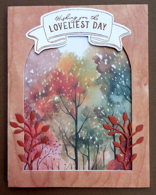
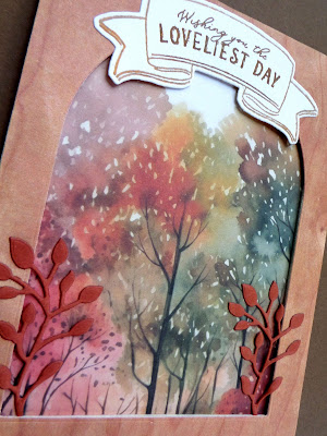
I had purchased some arched rectangle dies recently and I wanted to use them on a couple of Thanksgiving cards. I thought they made a nice frame that could be popped up over one of those pretty treescape papers.
The banner at the top was stamped with Versamark and heat-embossed with gold EP, then cut out with the coordinating die.
I added a die-cut leafy sprig on each side of my frame to add some extra interest and dimension.
.I happened to have some little corner stickers in my Thanksgiving card supply box, so I used them on the inside of this card. This was a larger card--4 1/2" X 6"--so I thought these stickerrs helped fill the inside and draw attention to the stamped sentiment.
I hadn't made this type of card in a very long time. When I've made them before, I have cut two panels from my main panel and then matted and stacked them, using dimensionals to raise each one. This time, I didn't want to detract too much from the pretty treescape, so I only cut one panel.
The sentiment and the mat for the smaller panel were cut from the same cardstock.
I glued the sentiment directly to the center panel where there was some nice contrast with the blue colors in the DSP.
I used a couple of leaf stickers to frame the stamped sentiment on the inside of this card.
This card was a new fun-fold for me. I don't recall its name, but it starts out as a modified Z-fold, where the right side of the fold on the front is narrower than the left portion.
The word "thankful" was die-cut from gold metallic CS and glued to the panel on the left.
When you open the card, this is what you see. I love that the entire scene is displayed.
The sentiment and a small leaf were stamped on the right panel.
This is a birds-eye view that shows you how the card was constructed. If you think you really want the directions for making this card, let me know and I will hunt them down for you.
My Thanksgiving cactus is now in full bloom. I hope to get a photo of it tomorrow, and if it's a decent one, I will share it in a future post.
Thanks so much for stopping by, and remember to laugh--a little or a lot--every day.
Cheryl


4 comments:
Another set of beautiful cards. I am really liking the landscapes on these papers. That domed frame really sets off the scene and the sprigs draw the eye in. I am intrigued by that fun fold. I would like the instructions. I need to use more different folds.
Beautifully done! Love the last fold!!! You are inspiring me to buy more stuff though…shame on you! Just kidding! Thanks for sharing!
Three wonderful cards, Cheryl, but I especially like the third one - great fold!
Beautiful Cheryl!!! Fab layouts and your autumn papers are soooo pretty!
Post a Comment