Wish List

Wednesday, November 20, 2024

A birthday card for my granddaughter...

 My granddaughter's 18th birthday is today, and this is the card I made for her.

It's a very simple, die-cut design on the front of this 4 1/2" X 6" card. I used my computer to print out the sentiment and popped it up on foam tape. The fun part is on the inside.


When you open the card, a mechanism swings two small, square panels out from behind the popped up oval. This sentiment was also printed with my computer.


This is what the card looks like on the inside when it is fully opened. I added a pocket on the left for a cash gift. 

I added a die-cut image on a small circle to each of the pop-out squares, keeping with the theme of "cool."

Isn't that a fun mechanism? I actually saw a video that used a die that cut and scored the mechanism. I saw how it was done, guessed at the measurements and created one for myself...and it worked perfectly! 

I love making interactive cards, and this is one I will make again...if I can find that little slip of paper where I wrote down the measurements I used. LOL

Thanks so much for stopping by, and remember to laugh--a little or a lot--every day.

Cheryl

Monday, November 18, 2024

Some final Thanksgiving cards...

Last night, as I was planning this post, I was sitting in front of a roaring fire in the fireplace. The warmth of a fire always feels so cozy on a chilly Autumn night.

This will be my last post of Thanksgiving cards this year, even though there are several more that I have made. It seems I would have to post every day to share all the cards I make, and I'm not willing to do that right now.

This card was made with an intricate AI image of a maple leaf. I loved the colors in it and tried to use some gems to highlight them.


Here;s a closer look at this unique design. 


I added a computer-generated sentiment on the inside.


This card came together because I had the embossed panel and the pumpkins on my desk. I lightly sponged some gold metallic ink onto the embossed dots. The embossed panel was a little narrow, so I added a matte gold strip to each side. I also heat embossed the stamped sentiment.


The biggest pumpkin was glued directly to the embossed panel and the other one was popped up on dimensionals.

I cut a leafy vine from the matte gold paper to accent the pumpkins.


The sentiment on the inside was stamped with gold metallic ink.


The blue-gray DSP and the solid CS on each of these cards is a nontraditional color for Thanksgiving, but I liked the contrast with the copper-colored maple leaf, which was die-cut.

This is a top-folding card where the top is 1/2" shorter than the back. The sentiment was glued directly to the card front and three flat-backed, blue-gray pearls were added.


When you open the card, you still see the strip of CS at the bottom.

I've added a couple of punched leaves to accent the stamped sentiment.


This cardbase is the same as the previous card, except that it is side-folding. I popped the sentiment up on some thin foam strips. I didn't have any more pearls in a blue-gray color, so I used a couple of single hole punches to punch some little circles from the copper cardstock. After I glued them to my card front, I added some clear Nuvo Drops to give them dimension. They look just like enamel dots IRL.


On the inside, I added a stamped sentiment and a smaller die-cut leaf.

I am in the final stretch of getting Christmas cards made for my personal use, so I will have lots to show you in the coming weeks. I will continue making them to donate to the thrift store, but I will no longer feel pressured to get them done for myself! Yay!

Thanks so much for stopping by, and remember to laugh--a little or a lot--every day.

Cheryl

Friday, November 15, 2024

Flowery cards for different occasions...


I decided to take a break from sharing Thanksgiving cards and show you three cards I made a couple of months ago.

I had some flowery cardstock with matching punch-outs. I don't remember where they came from, but were probably leftovers from a partially used card kit. When the thrift store gets partial kits donated, they ask me if I can use them because they're not really saleable.

For this card, I started with an aqua card base and added the floral panel on the front. While it's difficult to see in this photo, the same color of aqua was included in the flower pattern.

Because the pattern was so strong, I covered it with a piece of vellum, holding it in place underneath the metallic gold banner. This nicely muted the pattern and let the focus be on the sentiment oval.

I popped up the scalloped oval after adding a little ink to the edges. Finally, I added a punch-out of the same flower that was in the background panel and three flat-backed gems.

This particular floral pattern really needed to be muted because the colors were so strong. I was happy with the way the vellum did its job.

Instead of blending a little ink around the edge of the oval, I used the ink pad to directly apply ink to the very edge. This makes the color a little more pronounced, but I like it.

This card was made using the same process as the first two. Once I had my steps determined, they all came together quickly.

Here's an example of what I did on the inside of each card. I adhered a pre-printed panel that was shaded with a light blue color and had some leafy sprigs at the bottom. I added a stamped sentiment on each one and three punched flowers.


As promised, here's a picture of my Thanksgiving cactus. The flowers are an unusual apricot color with hot pink stamens.

Did you know there are Thanksgiving, Christmas and Easter cacti, depending on the shape of their leaves and when they bloom?


Here's a close-up of one of those blooms. I'm always amazed at the color contrast between the petals and the stamens.

Thanks so much for stopping by, and remember to laugh--a little or a lot--every day.

Cheryl

Wednesday, November 13, 2024

Still more Thanksgiving cards...


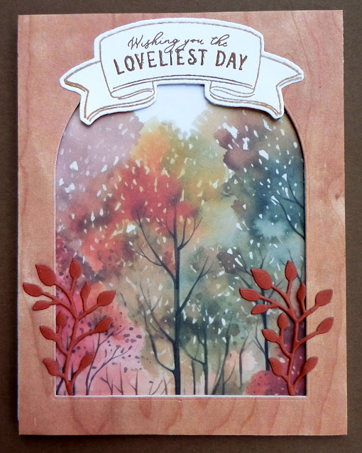
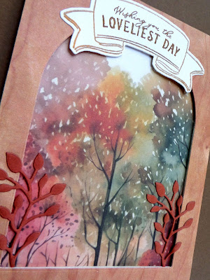
I had purchased some arched rectangle dies recently and I wanted to use them on a couple of Thanksgiving cards. I thought they made a nice frame that could be popped up over one of those pretty treescape papers.


The banner at the top was stamped with Versamark and heat-embossed with gold EP, then cut out with the coordinating die.

I added a die-cut leafy sprig on each side of my frame to add some extra interest and dimension.


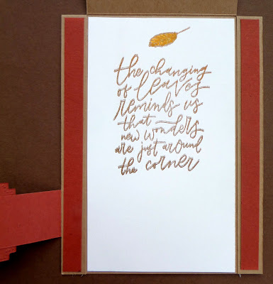
.I happened to have some little corner stickers in my Thanksgiving card supply box, so I used them on the inside of this card.  This was a larger card--4 1/2" X 6"--so I thought these stickerrs helped fill the inside and draw attention to the stamped sentiment.


I hadn't made this type of card in a very long time. When I've made them before, I have cut two panels from my main panel and then matted and stacked them, using dimensionals to raise each one. This time, I didn't want to detract too much from the pretty treescape, so I only cut one panel.


The sentiment and the mat for the smaller panel were cut from the same cardstock.

I glued the sentiment directly to the center panel where there was some nice contrast with the blue colors in the DSP.


I used a couple of leaf stickers to frame the stamped sentiment on the inside of this card.


This card was a new fun-fold for me. I don't recall its name, but it starts out as a modified Z-fold, where the right side of the fold on the front is narrower than the left portion.

The word "thankful" was die-cut from gold metallic CS and glued to the panel on the left.

When you open the card, this is what you see. I love that the entire scene is displayed.

The sentiment and a small leaf were stamped on the right panel.

This is a birds-eye view that shows you how the card was constructed. If you think you really want the directions for making this card, let me know and I will hunt them down for you.

My Thanksgiving cactus is now in full bloom. I hope to get a photo of it tomorrow, and if it's a decent one, I will share it in a future post.

Thanks so much for stopping by, and remember to laugh--a little or a lot--every day.

Cheryl

Monday, November 11, 2024

More Thanksgiving cards...


These two cards were made from the same paper stack as the ones in my previous post. 

In fact, I used only one sheet of 6" X 6" paper and cut it in half and matted it before gluing each half to a card front. 

This is a top-folding card. I cut the top of the kraft card base 3/4" inch in on each side up to the fold at the top. Then, after attaching my tab on the left, I glued these sections down and added a 1/2" strip of the dark orange paper.

The tab is 1" wide and long enough to reach across the front of the card and tuck a small portion under the narrow left side.

I actually made it extra long and then cut it off and fish-tailed the end of it so that it came to the edge of my card front. Two die-cuts, one with a sentiment, were added to the center of the tab.


When the center portion of the card front is lifted up, this is what you see--a stamped sentiment and leaf.


I also cut a sheet of the DSP in half for these two cards. The A2 card base had an inch cut off the right had side of the front and a matted circle with a stamped sentiment was added.


I thought the treescape was a little plain, so I added a die-cut deer. I really liked how it looked on the card.

The dots at the top and bottom were made with Nuvo Drops.


The stamped sentiment was centered underneath the narrower card front, so it looks a little off-center when you open the card, but I think that's ok.

I still have a lot of Thanksgiving cards to share with you. I'm not sure I'll get them all posted, but I'll do my best.

Thanks so much for stopping by, and remember to laugh--a little or a lot--every day.

Cheryl

Friday, November 8, 2024

Thanksgiving cards using landscape patterned paper...

I purchased a pack of a dozen 6" X 6" fall landscape papers to make some Thanksgiving cards. I thought I'd share a couple of them with you today.

This was an interesting fun fold card to make. It is essentially a Z-fold card, and the left side of the "Z" tucks under the small card that is attached to the right side. The bronze colored leaves were some that I had in my stash. I'm not even sure where I got them, but they have a nice metallic sheen and are very delicate.


This is what was stamped inside the 3" X 3" top-folding card that was on the front.


And this is how the card looks when it is fully opened. You can see that I used the entire 6" X 6" piece of DSP, cutting only 3/4" off the bottom so that it fit on my A2 size card.

This card is a gate-fold card that was a little larger ( 4 1/2" X 6"). All I did for the front was to add two pieces cut from one of the 6" X 6" sheets and a stamped sentiment that had been die-cut with an oval die. I used my metallic gold ink pad to add a little ink around the edge of the oval.

As an embellishment, I added the little bow tied with metallic string.

I stamped a sentiment and a small leaf on an off-white panel on the inside to finish this card.

I will have more of these fall scenery cards to share with you in upcoming posts. It was so much fun to play with these beautiful papers.

Today, I got to pay a little unexpected visit to the dentist so she could repair a broken tooth. A piece of one of my upper teeth broke off when I was eating a BLT. Go figure! I guess my teeth are just getting weak and old like the rest of me. Sheesh!

Thanks so much for stopping by, and remember to laugh--a little or a lot--every day.

Cheryl

Tuesday, November 5, 2024

Let's Craft and Create Challenge #213: Anything Goes or Add a Bow (option)...


As winter fast approaches, I'm working hard on my holiday cards. I was so glad to see that this month's challenge option at Let's Craft and Create was "Add a Bow." I had a Christmas card in mind that did, indeed, include a bow.

Here's what I made:

This is a "puzzle gate-fold" card. It was really fun to make and allowed me to use up some of my Christmas paper scraps.

I got the idea for this card design from Heidi Collins at On Y Go! Stamping. If you'd like to watch her video tutorial for making this card, you can see it here.

The gatefold sides of this card fit together like two puzzle pieces. That means you need to be fairly precise with your cutting, but it's really not hard at all.

The center embellishment--in my case the "joy" tag--can help obscure any imprecise cuts, too.

The word "joy" and the holly were die-cut and glued to the tag.

I have a bag of little red bows that I had ordered online with the intent to use them on my holiday cards. They are a great size for adding to tags, wreaths, candy canes, etc.

This is how the card looks when it is open. You can see how the two sides will fit nicely together when it is closed.

And here's a bird's eye view of the card when it is displayed on a flat surface.

I hope you'll try this or another card design and enter your creation in this month's challenge at Let's Craft and Create.

Thanks so much for stopping by, and remember to laugh--a little or a lot--every day.

Cheryl

Monday, November 4, 2024

Another pretty AI image for an anniversary card...


 When I came across this AI image on one of the Facebook sites I frequent, I just had to use it for a card. I love jewel tones, and this image is chock full of them!


I thought this rose, in particular, was so pretty.

I matted my printed panel with black cardstock and put it on an aqua card base.

The sentiment was stamped, die-cut and popped up on foam tape.

Three aqua gems were all the embellishment that was needed.


A simple stamped sentiment on the inside finished off the card.

This was so quick and easy, but I love the final result.

This is just a quick post today, because I will have another post tomorrow for our monthly challenge at Let's Craft and Create. I hope you'll come back and visit that post, too.

Thanks so much for stopping by, and remember to laugh--a little or a lot--every day.

Cheryl